January 21 2024
it’s me, the font derg
Process
This is the standalone version that I posted on Mastodon. For this version I swapped the timing around so that the page turn comes first, so it’s more apparent it’s an animation when the user hovers over it. Also having a brighter blue background makes it work better on its own. The other version is on my home page, which this animation was intended to be used for.
Up to the launch of this identity my original plan was to use a version of the intro wave for the front page of my website. I decided against it for a couple reasons. The first is that there’s quite a bit of motion which would distract a lot from the text. The second is that I’m seen making eye contact and waving directly, which may be uncomfortable for viewers if maintained for too long. And there’s no good way to loop an animation like that.
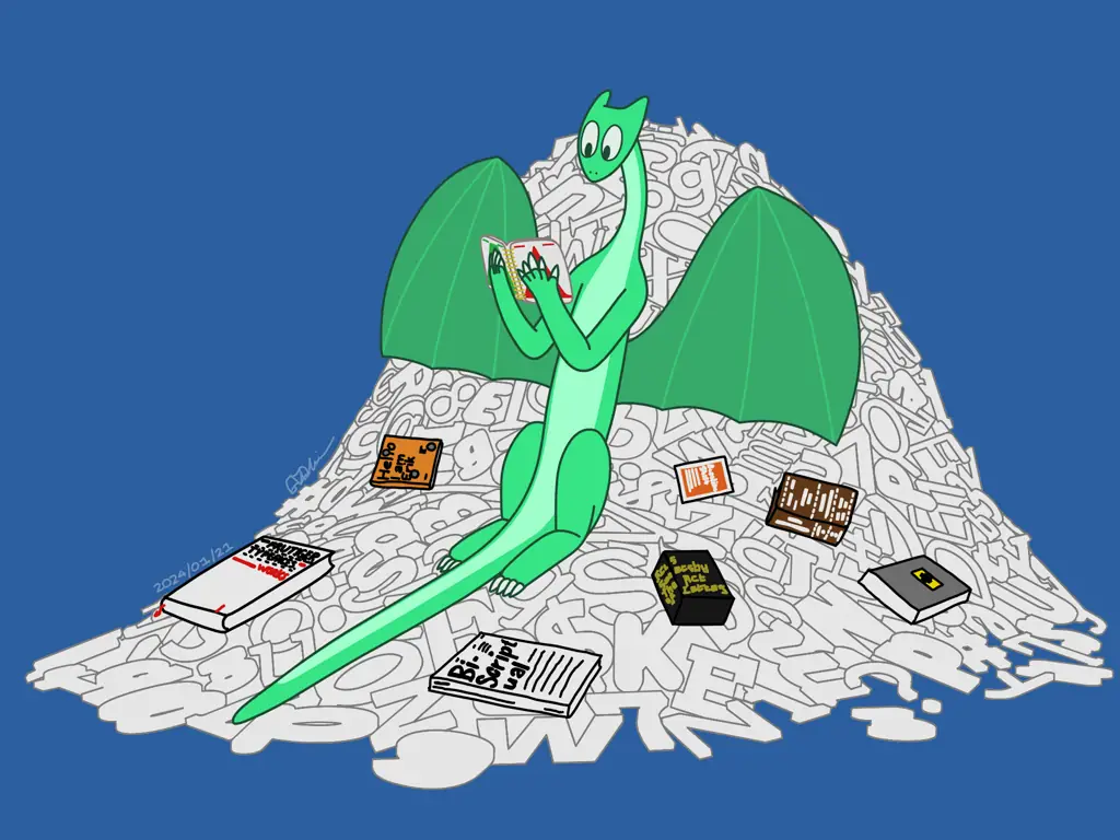
So instead I opted for something more low-key, where there’s very minimal movement and I’m engrossed in the type specimen of one of my favorite fonts of all time (ABC Arizona). In a way this is a redo of the original Mastodon wallpaper, but this time I really fleshed out the full idea I was after (whereas that wallpaper was done way too quickly).
The pile of glyphs
What people may call “letters” or “characters” in the typeface sense, I will be referring to as “glyphs”, which is the more technically correct term here.
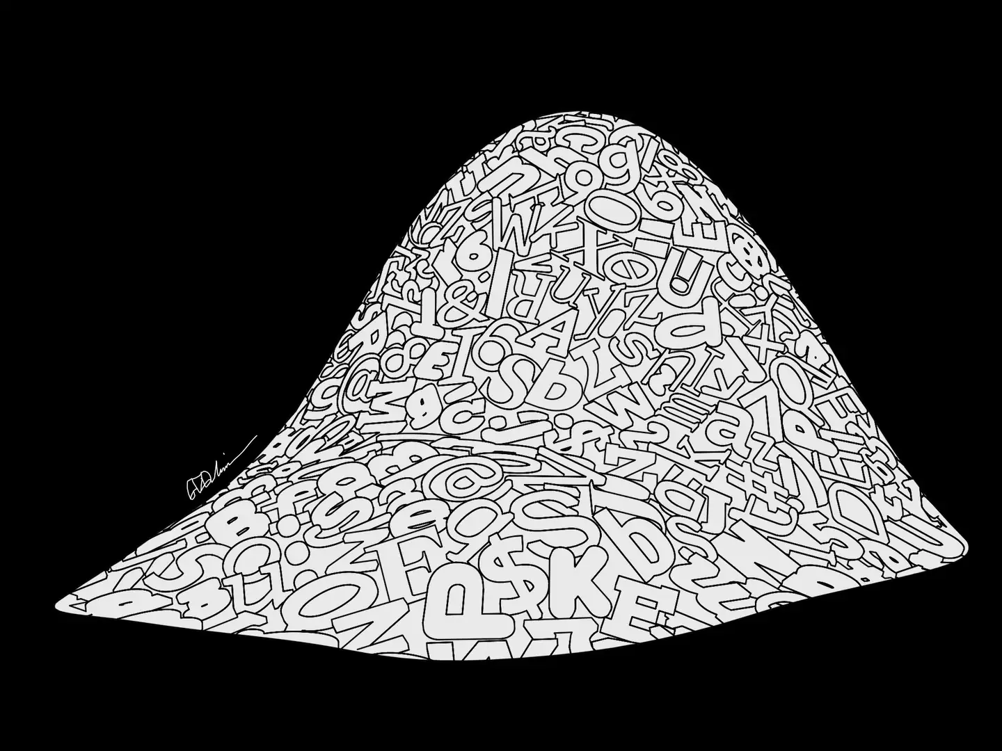
The first key element I tackled was the pile of glyphs I’d be sitting on. To achieve this, I first wrote two Python scripts, one that preprocessed a selected list of in-progress typefaces in my workspace, and then randomly extracted around a thousand glyphs from those files and saved them out as individual SVGs. Then, I headed into Blender and wrote a small script that batch imported SVGs from a folder and randomly scattered them in a 2D plane. I extruded them, collected them (with a modification of a script) into a smaller rectangular area and had all their rotations randomly picked in order to force imperfections when I would manually re-rotate them (although I wouldn’t do that at first).
My initial idea was to use rigid body physics to simulate an actual pile of glyphs. I would enable rigid body physics for all the glyphs, have a floor for them to land, and then I’d find some way to gently set each glyph down on the pile and let the simulation take care of things. Alas, it did not work this way. I tried various holding shapes, flask-like structures and what not. If I put them all in a vertical line and make them fall I’d get the best results with this approach but the glyphs on the top half would reach enough velocity from gravity to disrupt the pile. The pile also looked too chaotic. And the glyphs, being very particular non-convex shapes, don’t play the nicest with the nature of physics simulations. Often they would unnecessarily glitch out among each other and using the “Mesh” holding shape for a thousand rather detailed meshes is much too expensive.
So I scrapped that idea, realizing that by the time I would figure out how to pull this off with rigid body physics it would’ve taken just as long or would even be faster to make the pile manually. I also realized that it would give me the chance to strategize how to balance the level of detail since all of this would be rendered as line art and it would be very easy to make it look too complicated and noisy. To handle detail complexity, I started by building a mesh that served as the basic shape of the pile, by creating a grid mesh and using the proportional editing tools to create smooth peaks and get the shape just right. It intentionally intersects with the floor, so I can control its height and size more easily. Then I took a handful of glyphs from my randomized rectangular region and set them close to my base pile shape, and manually placed each and every glyph on that base shape.
I had a few specific rules in mind when building it. First, in order to keep my sanity, it was completely okay for the glyphs to touch or go through the base shape somewhat. Second, I tried to avoid similar characters (what the glyphs represent) being too close to each other. Third, glyphs are allowed to be upside-down but not backwards, at least for glyphs that are noticeable when they’re backwards. Fourth, glyphs were carefully positioned and rotated to mostly hide the visual edges of the base shape, to contribute to the illusion of it being a massively deep pile of glyphs. Fifth, additional glyphs were placed on the bottom physical edges to make them “spill” out of the pile.
There were one or two times where I adjusted the holding shape as I placed the glyphs, because I had a particular relationship in mind between the size of the glyphs and the size of myself. I wanted to get that mostly right before going to the rough animation stage. But adjusting the holding shape midway meant I’d have to reposition a good chunk of the glyphs by hand.
In total there are exactly 233 glyphs that make up the background. One idea I had was to do at least two layers of glyphs, the inner one receiving a lighter line art than the front one. But that first layer turned out to be plenty detailed. I also went back and randomly re-rotated a good chunk of the glyphs to make the pile feel less smooth.
The final step was figuring out the generation of line art from this. Blender provides a convenient feature where you can make a collection of objects to apply line art to, and then going to Add → Grease Pencil → Collection Line Art. This creates a Grease Pencil object containing a Line Art modifier with the target collection set to the one you made. From there you have a variety of options to choose from, among which you can define whether the line art follows the ridges of the objects (Contour), if the whole collection is just one big silhouette from the camera’s perspective (Silhouette), or each individual object is a silhouette (Individual Silhouette).
Initially I made all of them Contour, because I wanted the 3D depth of the letterforms to be captured in the line art. Then I selected a few whose lines were too dense (because the glyphs had finer details or they were visually grouped closer together like in the flat region) and put those in a separate collection and added a second Line Art object to make those Individual Silhouette. Then I kept selecting a few more objects and moving them to the silhouette collection. And then I kept moving more and more objects to be silhouettes. Eventually I decided to make all of them silhouettes.
After that I made two renders. The first was just the glyph outlines, which were exported out as an SVG using Export → Grease Pencil as SVG. The second was the base holding shape, which was not a perfect white but totally shadeless and about 90% brightness or so. I went into the outline SVG and rescaled the outline thicknesses since they turned out to be much too thick compared to how it looked in Blender. Since the Line Art modifier isn’t perfect at what it produces, I made a number of corrections and adjustments to some of the outlines, taking some lines out, and adding new ones to close some shapes that didn’t get closed. This was done in Inkscape.
Then the outlines and base shape were both imported into Krita. Since the glyphs are only represented as outlines, I filled them with the color of the base shape in the base shape layer. And since the outlines were made black during their creation, I made them substantially brighter, in fact a lighter grey, to call more attention to the foreground elements (myself and the books).
Rough animation
The rough animation was done in Krita, once again. As always, I spend a disproportionately high amount of time on the first keyframe, which in this instance is me holding the book. I wanted to get my own proportions closer to what they actually are, since my head was a little bit large in the previous animation. It’s also a fullbody, which I had been meaning to do at some point.
Reference is important, but that doesn’t mean reference has to be an image or a video of something. While that can be useful, sometimes all you need to do is enact the character’s action yourself. Pay attention to how you’re posed as you perform the action, and try to translate that to your animation. This does not always work, but in the right situations it can.
One thing that I didn’t model in the rough that I added in the cleanup process is the slight shifting of the book as I shift my hand.
Rather than animating at 24fps, I decided to animate at 12fps because most animation is in doubles, I wasn’t in absolute need for singles, and it’s more efficient storage wise. (This isn’t as much of a problem with the variable frame rate versions on the site, but the actual master files are still constant frame rate.)
In this timelapse I massively sped up the part where I draw the first keyframe, in order to focus on how I did the animation. The animation process wasn’t exactly “easy” but definitely less complex than the previous one.
Cleanup and Coloring
I originally planned to also use Tahoma2D for this, like the last one I did. But it randomly crashed (luckily very early on) and I just said I was done with that program. So I switched to OpenToonz. I had chosen Tahoma2D because my impression was that it was just a “better” version of OpenToonz. But now actually trying OpenToonz itself, it really wasn’t any different. There are a couple of small quality-of-life features that are in Tahoma2D that are not in OpenToonz. But the smoothing algorithm in OpenToonz is way ahead of Tahoma2D! Procreate has a similar style of smoothing (I’ve never used Procreate but I have watched friends use it) and honestly, this is the best kind of smoothing ever. So that’s why the lines look way smoother than my last one.
Sadly the line coloring system still doesn’t seem as intuitive to me as Harmony’s, but I did figure out a pretty neat trick: with Snap turned on and a brush set to identical color and a smaller size than the lines I want to fill, I just draw a small closed shape around the area and I can reliably fill or unfill it. I can also draw a thinner line inside a problematic area of lines to fix problems.
For at least some of the cleanup what I tried was drawing a shape that was close to but intentionally not right on the rough lines. The high smoothing value makes it so that I can adjust the points afterwards to get the shape I’m after. One has to be careful, because as I figured out, they act like cubic Bezier curves in terms of controls (with the handles), but they seem to be weighted in a strange way. Sometimes the curve is not quite a curve; part of it will be weighted really closely towards the handles, which is not the kind of behavior you’d get from vanilla Beziers. So something tells me they’re more general weighted splines or something.
When I did the previous animation, to handle self-overlapping body parts, I would slice the overlapping line art, paste that into a separate layer, then try to draw lines underneath them that were the same color as what I’d fill the lines. For this piece I deliberately made duplicate copies of some of the strokes. For instance, the body layer also has the outlines for the arms, and the arm layers have the same strokes but I fill only the part that’s overlapping. This gives me more control over where I can place the fill boundary but I’m not so sure that was an improvement over the previous technique. I do get the benefit that I can better place the fill boundary wherever I want and it doesn’t have to be on the endpoints. And honestly it made coloring somewhat of a nightmare, but at least I got it done and I’m pleased with the results.
Can I do an animation that doesn’t involve overlapping body parts for once?
The compositing for this one, luckily, was much less complicated unlike the last one. In fact, all I needed to do was import the background into OpenToonz and export it out as an image sequence. Bam! Done! But not quite, because I forgot to do the books and the signature. So I painted those quickly in OpenToonz, exported them out as single images and imported them into a Blender timeline to composite those together.
I originally imagined a black background for this piece, to go with the black background on my website. But this didn’t feel right if I was going to post this outside my website. So I went for a calmer bright blue background that fit the vibe a little better. Maybe I could’ve done a textured background or something, but this background works and I already spent enough time on this thing.